Siding Material Company Full Website Redesign
Introduction
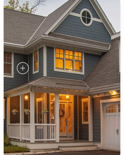
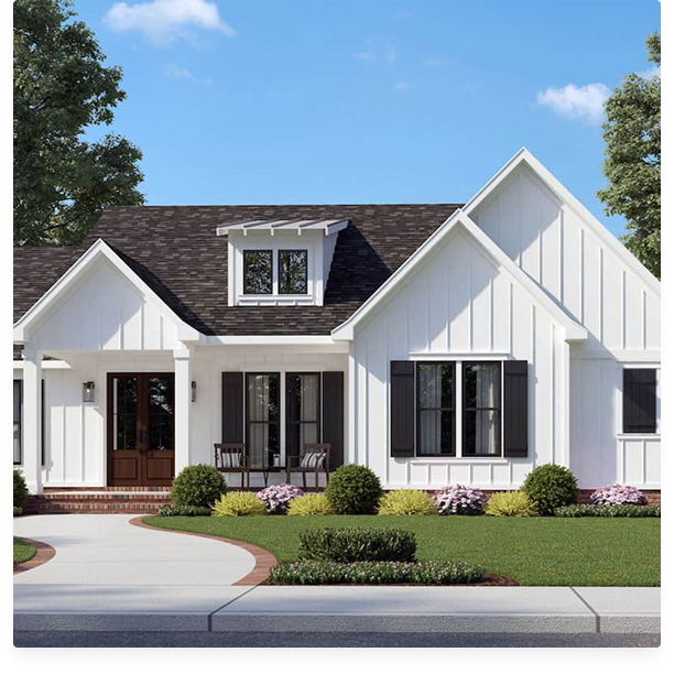
Project
A leading building materials company sought to revamp its website to reflect its premium brand and improve user experience.
My Role
I led the UX design for the entire website, focusing on creating a modern, user-friendly experience that streamlined user journeys and enhanced engagement.
Project Timeline
18+ months
Tools Used
Figma
The Challenges
Outdated Design
The visual design felt dated and did not align with the brand's premium positioning.
Confusing Navigation
Users struggled to find information and explore products effectively.
Tedious Product Pages
The product detail pages were cluttered and lacked a clear call to action, particularly for ordering samples. The process was cumbersome and unfamiliar to users accustomed to e-commerce experiences.
The Approach
My approach focused on simplifying the experience while elevating the brand’s perceived value.
I began by clarifying the site’s structure and navigation so users could intuitively understand where they were, what was available, and how to move forward with ease.
From there, I refined the visual language to feel more modern, restrained, and aligned with a premium brand presence.
On the product detail pages, I reduced cognitive load by removing unnecessary clutter, prioritizing essential information, and introducing clear, familiar calls to action. Special attention was given to the sample ordering flow, reworking it to mirror trusted e-commerce patterns so the experience felt natural, efficient, and confidence-building rather than confusing or tedious.