Motorcycle Rewards App Redesign
Introduction
Project Goal
To redesign a motorcycle rewards app, focusing on improving user-friendliness and modernizing the user interface.
My Role
UX Designer responsible for research, information architecture, interaction design, and prototyping.
Project Timeline
Two months
Tools Used
Figma

The Challenge
Usability Issues
The existing app suffered from a confusing navigation system that deviated from common app design patterns. This made it difficult for users to find the features they needed.
Inconsistent UI elements and a dark background contributed to a cluttered and dated look, hindering the overall user experience.
User Frustrations
Users reported feeling lost within the app and frustrated by the time it took to complete simple tasks.
The outdated UI made the app feel less trustworthy and contributed to a negative perception of the brand.
The Approach
Research
Initial user interviews revealed key pain points in the navigation and visual design.
Information Architecture
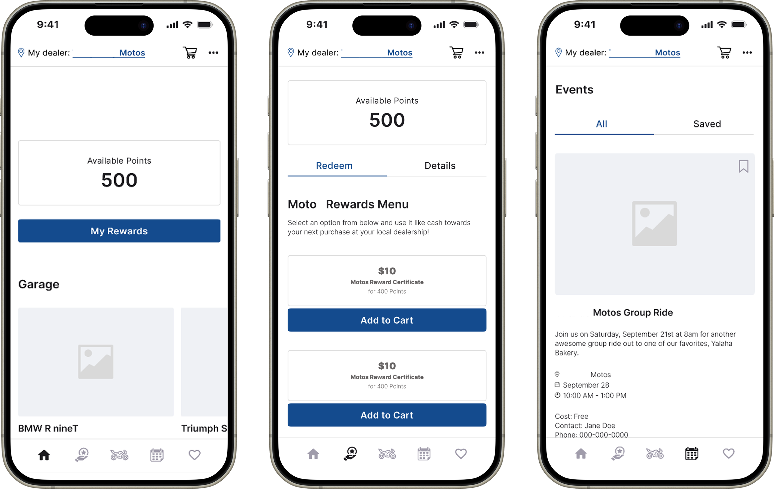
I restructured the app's information architecture to create a clear and logical flow, grouping related features together.
A new tabbed navigation bar was implemented, adhering to familiar mobile design conventions.
UI Design
I replaced the black background with a lighter, more modern color scheme to enhance readability and visual appeal.
UI elements were standardized throughout the app to create a cohesive and professional aesthetic.
Emphasis was placed on simplifying the interface, removing unnecessary elements and streamlining user flows.
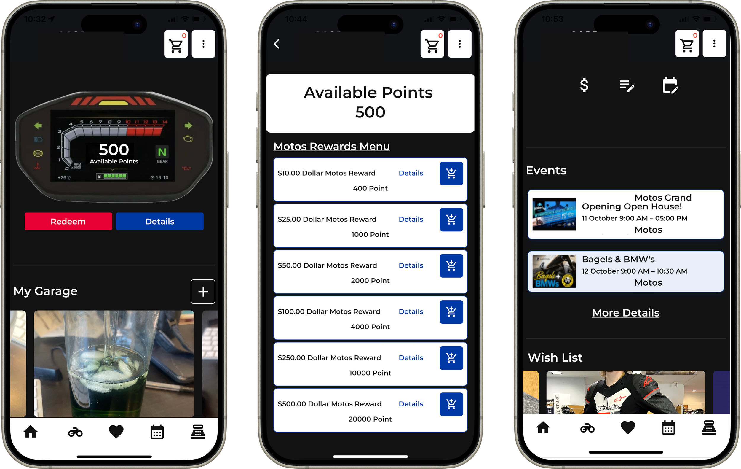
Before